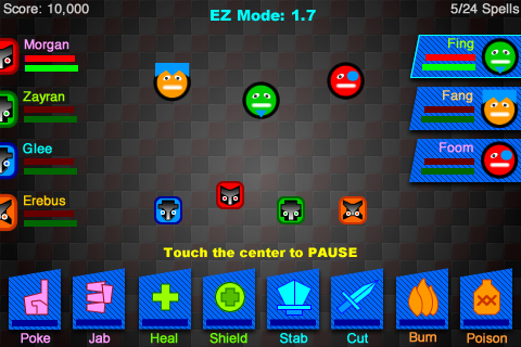
There is nothing quite like real user feedback. The Dungeonators game that I started coding about a year ago has been through several design iterations. Before I wrote a line of code I mocked up the whole UI and tested that on my friends and kids (paper prototype, an honorable UI design tradition). And with each development build I tested everything again and even enlisted strangers. I must have played though the final release candidate a 100 times. (It was then that I realized that game programmers must get sick of their games if they properly test them!)
When I uploaded Dungeonators to the App Store on 14 October 2011 I was pretty confident about the game play and the user interface. Famous last words as they say 🙂
After an initial healthily growth curve Dungeonators installs tanked:
The message I get from this user adoption curve was simple: Dunegonators stinks!
So I went back to the drawing board to search for the stinky bits. After much reflection I realized three things:
- Dungeonators is too hard for casual users and too easy/dumb for hardcore gamers. People who play MMORPGs like World of Warcraft punch through my game. People who play Angry Birds get stuck around level 1.6. (Which is as far as you can go if you don’t know what you’re doing.)
- People don’t know what to touch. They want to touch the avatars and not the raid and spell frames. If you don’t know what raid frames and spell frames are then you are not going to get my game.
- I was going to have to fix this. I could fix this problem with a lengthy tutorial or FAQs. But Dungeonators is causal game not productivity software. I never read manuals and skip tutorials. I expect my audience to have the same level of self respect!
- The good guy raid frames (on the left) are no longer touchable: They just display status. I couldn’t find a casual user who knew what a raid frame was so I got rid of raid frames.
- Good guy spell frames are no longer associated with good guy raid frames: Spell frames are now modeless and never hidden. Each good guy has two spells available 24/7. As the game progress the spell are automatically upgraded. I’ll have to rewrite the game mechanics to handle the fact that the total number of available spells has gone from 4 x 6 (which I understand is 24) to a mere 8. But that actually makes Dungeonators a heck of lot simpler to program and to play.
- The bad guy raid frames are still touchable and still enable the player to switch targets. But in the original UI you could have separate bad guy targets for every good guy. In the revised UI all the Dungeonators are synchronized. It’s a gross simplification that is all for the best.
- Touching the center of the screen, where the avatars live, is still not part of the game play but if you do, the game will pause and bring up the main menu. I was able to kill two birds with one stone: No main menu button and a valid response to a user touch. Feedback is everything thing: In the original design touching the center of the screen was ignored and could have been interpreted as the game freezing up.


