My comic book collection iOS app continues to evolve. I continue to strip out features and focus on the core mission: Buy a comic, snap a photo, add it to your collection.
With that in mind the UX now looks a lot like a photo app that has been preconfigured for storing comic book metadata. Here are the most recent screen shots from my iPhone XS Max:

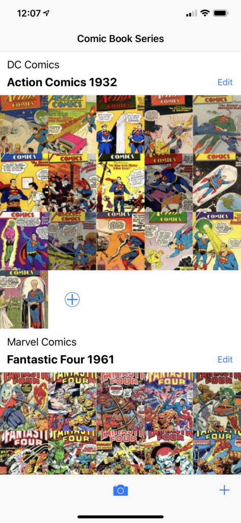
Summary View 
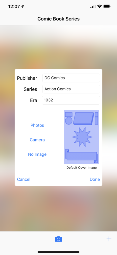
Edit Series Popover 
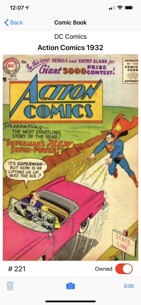
Detail View 
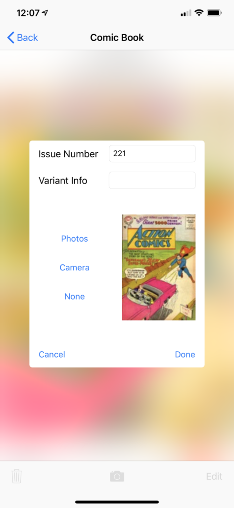
Edit Issue Popover
Summary View
The Summary View displays a scrolling list of series. Each series displays the covers you have photographed. Right now I’m using placeholder covers–I don’t actually own the original Superman comics from the 1930s! This is all built with standard UIKit UIViewController and UICollectionView. I’ve added a custom UICollectionReusableView for the header of each section (series) and for the last cell of each collection I’m using a custom UICollectionViewCell.
I sort the comic book covers in each section by ID, which is a mashup of issue number and variant string. I sort these strings using localizedStandardCompare so that issue 2a comes before issue 20. I love localizedStandardCompare because I didn’t have do any work to solve the thorny “sort strings with numbers and letter as if they are numbers” problem.
The custom collection reusable view is mostly there to display the publisher, name, and era of a comic book series but also to host an edit button that brings up an EditSeriesPopoverView.
Popover views are cool but no longer supported as a presentation type by UIKit so you have to manually display them. I use a UIVisualEffectView to blur out the background behind the popover. I love it when I don’t have to write code!
Detail View
Each detail view displays a large image of the comic book cover photo and some metadata around it. The UISwitch sets the alpha of the cover image to 0.3 if false and 1.0 if true–this give you a nice visualization of what you still have in your collection and what you have sold.
The Edit button brings up the EditIssuePopoverView. I’ve figured out how to pass functions so that I can reuse popover views from different buttons: add an issue vs edit an issue. That’s very cool and has ramifications for how hardcoded view controller need to be to views.
Cutting Scope == More Value
This app looks nothing like my initial conception and has far less functionality than I thought I needed. I find this to be true with most apps I download. They do too much and don’t focus enough on their core use-case. Too much scope means the value of an app is diffused like the pixels behind a UIVisualEffectView.
As always you check out my code on GitHub!


